Web Redesign for Cast Aluminium Garden Furniture Supplier.
- Case Studies
- 21st June 2024
- Abigail
Introduction
For over 18 years, Four Seasons Garden Furniture has specialised in high-quality Cast Aluminium Garden Furniture. Working closely with their factories, they produce stunning designs with careful attention to detail. As an online retailer with a showroom in Warrington, they also participate in garden shows and events throughout the year. They aim to provide the highest quality garden furniture in the UK at excellent value.
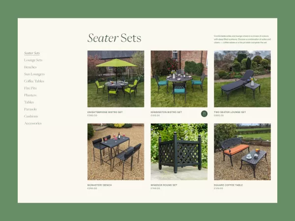
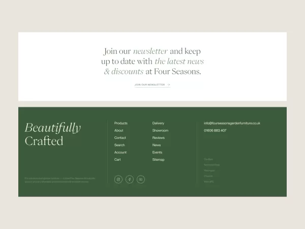
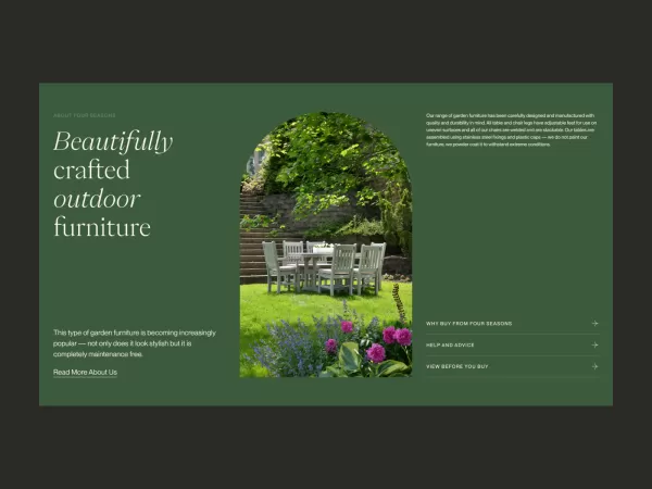
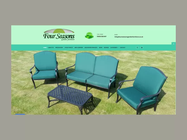
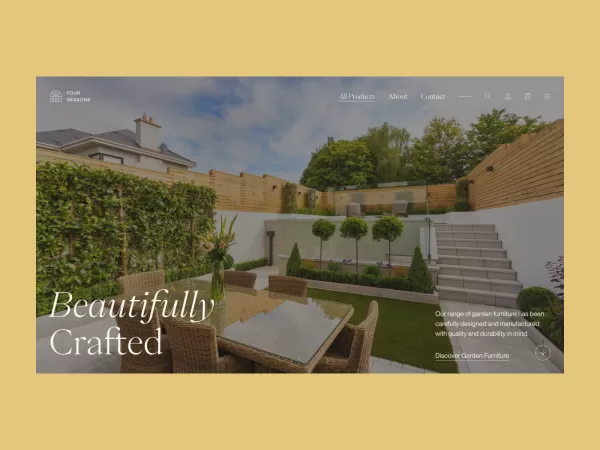
We began working with the client in November 2020 under a support contract, with goals to enhance their existing eCommerce website, improve user experience and resolve flagged issues. After a few years, we focused on significantly improving the website's appearance, user engagement, and conversion rates. With help from the bounce-back package, we delivered a fully custom-designed OpenCart website that reflected the high-quality products and provided customers with a more informative, user-friendly navigation experience.

Research & Discovery
We analysed competitor websites and used heat mapping software to gain insights into customer interactions and find solutions to enhance the website entirely. We also reviewed Google Analytics and Google Search Console data to understand website and page performance and to help us make an informed decision about creating a high-performing web presence with a focus on user experience.
Planning and Strategy
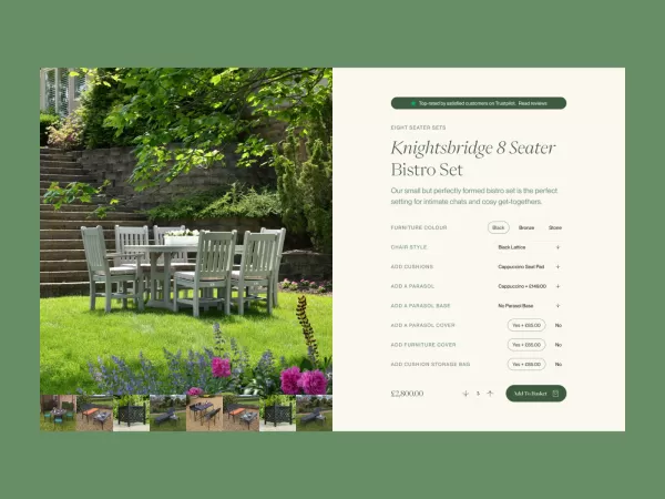
We focused on redesigning the homepage, product pages, and checkout process primarily as these were the critical areas on the website where we wanted to improve user experience and visual appeal; this allowed us to easily apply the design to the rest of the website to create a sense of consistency for the brand. While the website demographic was primarily users aged 45 and above, we can see a strong community of customers of all ages who frequent the website, which played a vital part in how we designed the website.
Design Process
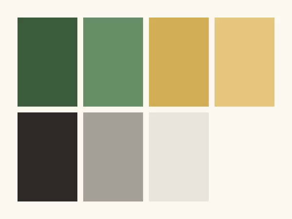
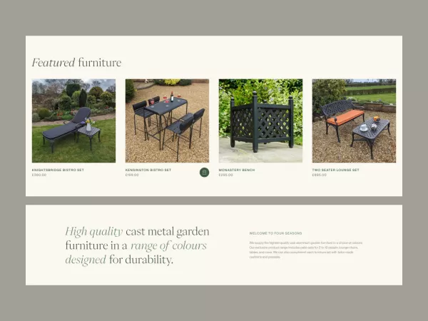
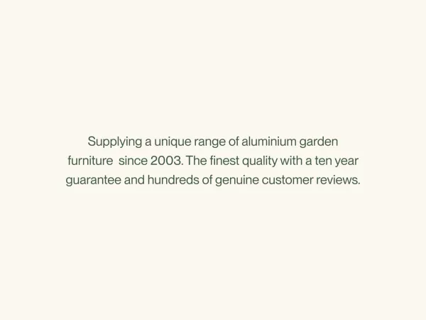
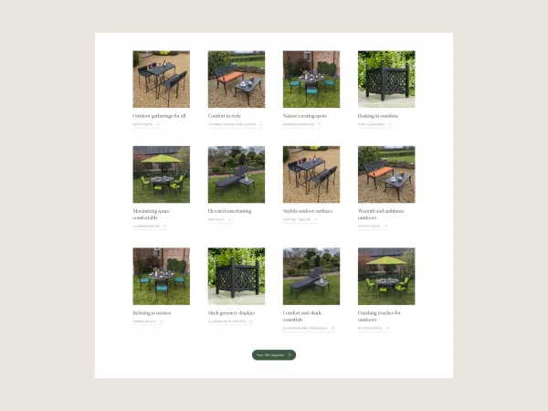
We put together a basic wireframe using the information we learned from the previous steps. This wireframe outlined how we planned to layout the website and gave an idea of what features/ sections we’d implement on the new website. Once that had been approved, we could move on to the design and begin looking at choosing a modern colour palette and clean typography, working with the client to prepare high-quality images that are ready to showcase the products in all their glory.
Accessibility
Accessibility is always a priority on any site we build, as we strive to provide an inclusive experience for all users. Key measures included providing text alternatives for images using alt attributes and ensuring readable text through sufficient colour contrast and appropriate font sizes. We also ensured that content resizes properly without losing functionality. To enhance navigation, we used ARIA labels for non-descriptive elements like icons and employed semantic HTML to define page structure clearly. Additionally, we validated our markup with the W3C validator and ran comprehensive page speed reports to identify and address common accessibility issues, such as missing alt text and improper heading structures.
Testing & Launch
Following the build completion, we worked through the website as a team. We tested various aspects of the functionality, logging any bugs or issues and resolving them. We ensured the website was in good working order before handing it to the client for final approval.
Once signed off and a go-live date is agreed upon, it’s time to perform the final data migration to ensure no orders, customers, or anything else gets left behind, providing a seamless transition into the new website for both the client and their customers.
Once live, the website's vitals are closely monitored to detect any issues that might present themselves during live user cases. We also ensure that any old URLs are correctly redirected, and to ensure there are no broken links throughout the website, we use specialist software to crawl the website to analyse all the links.
Results & Outcomes
The Four Seasons Garden Furniture redesign & build proved incredibly successful in offering an improved user experience for the customer, aswell as ease of management for the business itself. Implementing the Welford Cart, our bespoke one-page checkout system, aswell as the improved product page layout, helped increase orders and cart value, resulting in excellent website growth.
Despite the Cost of Living Crisis and environmental factors such as wet and mild summers, the website's performance improved significantly in the year following its launch compared to the previous period. The number of products added to the cart increased by 33%, and the number of orders rose by 20%.
Moving forward, Through the Business Boost service, we will continuously review the website's performance and make adjustments and improvements to ensure the website's appearance and content remain fresh, relevant, and what customers are looking for.
We also plan to have ongoing reviews of page performance and improve SEO through organic and paid methods.
