Make your site responsive before Google demotes you
- SEO & Marketing
- 5th February 2015
- Abigail
How often do you use your mobile phone?
Smartphones and tablets are quickly transforming the online industry and it’s important that you keep on top of these changes. A staggering 35% of all online traffic now comes from mobile devices - a number that keeps growing year after year. One of the most infuriating issues that arises with browsing on a mobile device is the number of websites that just aren’t up to scratch. Bad redirects, ill-fitting screens, incomprehensible text, lengthy loading times and unplayable videos are just the tip of the iceberg when it comes to non-responsive websites - and we’re not the only ones who are getting irritated.
Search engine giant, Google, has started cracking down on websites that aren’t mobile-friendly. Their elaborate search algorithm has taken mobile users into account for many years now, but the last year has seen some major updates emerge with regards to how Google treats websites that are not yet optimised for use on mobile devices.
Lower Rankings
One of the more recent updates to the algorithm has seen Google start to demote websites on organic search engine results to lower rankings if they are not correctly optimised for mobile use. No matter how much time and money you pump into improving your website’s search engine optimisation (SEO), you may still struggle to reach the number one spot for popular keywords if your website fails to meet Google’s high standards. Updating to a fully responsive website can help you to climb up rankings and get the edge over your competitors.
Mobile Friendly Label
In competitive industries, this simple yet powerful label can make mobile customers significantly more likely to view your website rather than your competitors’. In reverse to this, if your website is not optimised to Google’s standards you may notice a significant drop in traffic from organic search results - visitor may be discouraged from visiting your website if they’re pre-warned that they may not be able to view the page correctly.
One of the most interesting (and most obvious) changes has come in the form of the new “Mobile-friendly” label. When viewing a list of search results on a mobile device, Google now displays this label just before the site’s description to advise users on whether or not the website will show correctly on their mobile.
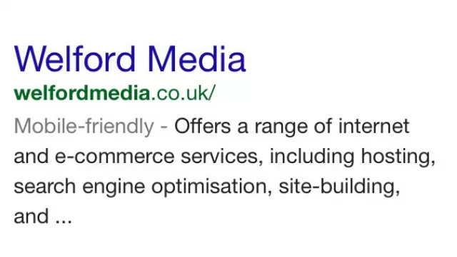 Google's mobile friendly label will now show in Google mobile search results
What is a responsive website?
If your website is responsive, your website design will automatically adjust to show a more attractive design based on the user’s screen size. Certain features of websites can be hard to use on mobile devices, so a responsive design adjusts them to fit better dependant on screen size.
Horizontal navigation bars can be hard to view on portrait screens (like mobiles & tablets) so many responsive designs convert them to a vertical style, making it easier to read and click each link.
Why go responsive?
Having a mobile friendly website ensures that your visitors have a fantastic user experience no matter what device they choose to use. On average, users decide whether they like a website within the first 5 seconds of visiting it. If your site fails to load quickly or is difficult to navigate on mobile devices, the majority of potential customers will abandon ship straight away. People are extremely likely to share their bad experiences with their peers, losing you more and more potential customers.
If you have Google Analytics set up you can easily see how mobile users are reacting to your website - if you aren’t using Google Analytics, you’re missing out big time. Get in touch with our team to find out how you can use it to improve your business. In your Google Analytics account, you can easily view how many people visit your website using a mobile device, which device they use and which browser. If you have ecommerce conversion tracking or goals set up within your Google Analytics account, you will also be able to see how many conversions you have received from mobile users compared to desktops users.
Make your website responsive
Our team of designers and developers are have years of experience in making websites responsive. You can even keep your existing website design, we’ll just make some adjustments so that it looks even better on mobile devices.